Responsive Design
I’ve been playing around with twitter bootstrap. It’s like a css framework to help designer or developer create a nice and clean site. It’s offer grid system, predefine layout, button, javascript, carousel etc. You can build website in just a few hours. Very nice for prototyping.
I’ve been using it to build this blog since it was version 1. Recently i had a chance to upgrade it to version 2. The new version offer a lot of functionalities, one the feature that I play a lot is the responsive design.
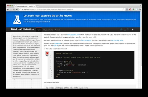
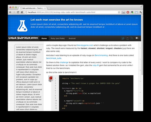
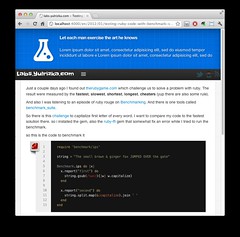
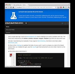
Basically Responsive Web Design (RWD) means the ability of the web site to adapt to the user screen size. So the page should look different in a way that it suited for specific screen. Like this website will look different if it’s open with mobile phone, portrait mode on tablet, landscape mode on tablet, net book or even in a large desktop. This actually achieved by using W3C CSS3 media query. It means that it uses different stylesheet for each of the screen size. More info on RWD in twitter bootstrap can be found here
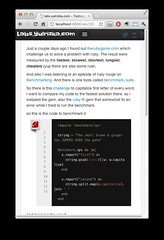
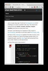
You can test this functionality by resizing your browser window. Try to drag it slowly and watch the page banner slightly change. here are the screen shoot of the design.

